5 types of Forex Charts with Advantages and Disadvantages
Forex charts serve to display and analyze the dynamics of the prices of a financial instrument over time. All of them are built on the basis of a specific period of time. Before you study graphics, you need to consider the time intervals used to build them.
The trading terminal MT4 provides the ability to display charts of nine different periods – from minute to monthly. The time interval determines the compression of data: the shorter the time period for which the graph is constructed, the less data is compressed and the more detailed it is obtained.
Each time period is characterized by the opening price (open), the maximum price (high), the minimum price (low) and the closing price (close). This set of characteristics is abbreviated as OHLC.
It should be noted separately tick chart – tick chart. Its scale is one tick, i.?. unit price quotation for sale and purchase). The tick chart shows the change in Bid and Ask quotes.
Types of Forex Charts:
LINE CHART
To construct a linear chart, only one price from OHLC is used. The selected price characterizes each time interval. Usually, the closing price is used as the most significant, and it is the closing price that is used to build line charts in MetaTrader
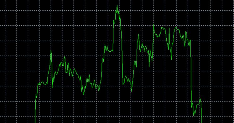
Advantages of Line Chart:
simplicity, convenience, the absence of excess information;
Disadvantages of Line Chart:
many price movements are overlooked; It is impossible to monitor the presence of gaps (gaps).
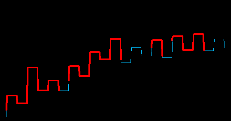
BAR CHART
The bar graph displays the dynamics of the financial instrument in the form of rods – bars, corresponding to the fluctuations of the exchange rate for each equal period of time. To construct such a chart, all four OHLC prices are used, characterizing each time interval: the maximum and minimum prices correspond to the vertical line, and the opening and closing prices are marked with dashes to the left and to the right of the vertical line, respectively.
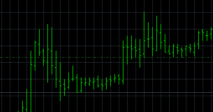
Advantages of Bar Chart:
the completeness of the displayed information (in contrast to the linear information, in the bar chart all movements of the price are displayed); the ability to determine the range of trades.
Disadvantages of Bar Chart:
the difficulty of assessing the period (visually less convenient to determine whether the asset has grown in value over a certain period or has fallen?); an overabundance of information.
CANDLESTICK CHART or “A SCHEDULE OF JAPANESE CANDLES”
This type of chart shows the change in the exchange rate of a financial instrument in the form of candles. All four OHLC prices are also used to build a candlestick chart. Usually, the candle consists of a body (a thick part) and two thin parts. A candle with a filled body indicates the growth rate for a given period of time, a candle with an empty body – about falling.
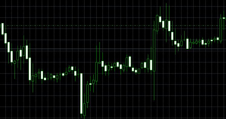
Advantages of candlestick chart:
the convenience of displaying price information in terms of its visual perception.
Disadvantages of candlestick chart:
an overabundance of information.
Described types of graphs – linear, bar and candle – are the main and most often used by traders. But there are a few “exotic” Forex charts that have not found wide application among traders. These include:
GRAPHICS RENCO
Renco charts display price changes in the form of diagonal rows consisting of rectangles (“bricks”). Each new rectangle is always displayed to the right of the previous one and is located above or below it. The specified price movement upwards (for example, every 10 points) is marked by adding above and to the right of the previous transparent rectangle, and moving downwards is by adding below and to the right of the previously painted rectangle.
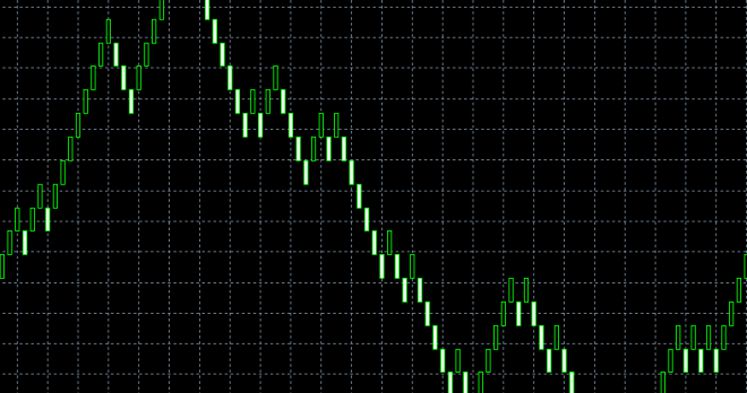
Advantages of renco chart:
a visual representation of the main trend by averaging the price; ignoring time.
Disadvantages of renco chart:
many price movements are overlooked; impossibility to monitor the presence of gaps (gaps); impossibility to identify the minima and maxima of individual intervals.
==== KAGI GRAPHICS ====
Graphs of kagi reflect price changes in the form of a series of vertical lines of different thickness, connected by short horizontal segments. Kagi-line is prolonged after the price in the same direction until the trend changes its direction. After the fracture of the trend in the price movement on the chart, an indent is made to the right and the construction of a new kagi line in the opposite direction begins which is connected by a horizontal jumper to the previous line in the place of the turn.
Advantages of Kagi graphics:
a visual representation of the main trend by averaging the price; ignoring time.
Disadvantages of Kagi graphics:
many price movements are overlooked; impossibility to monitor the presence of gaps (gaps); impossibility to identify the minima and maxima of individual intervals.
Existing types of Forex charts and their combinations allow you to choose exactly the kind of presentation of price information that will be maximally suited to the needs and requirements of each analyst, who are interested in financial markets, their dynamics and the possibility of extracting profits from currency trading and financial instruments.