Divergence Macd Indicator Part-1
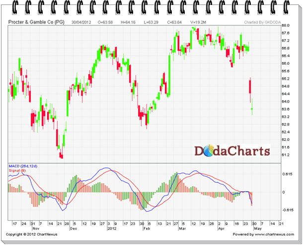
A trend-following momentum indicator that shows the relationship between two moving averages of prices. The MACD is calculated by subtracting the 26-day exponential moving average (EMA) from the 12-day EMA. A nine-day EMA of the MACD, called the "signal line", is then plotted on top of the MACD, functioning as a trigger for buy and sell signals.

There are three common methods used to interpret the MACD:
1. Crossovers– As shown in the chart above, when the MACD falls below the signal line, it is a bearish signal, which indicates that it may be time to sell. Conversely, when the MACD rises above the signal line, the indicator gives a bullish signal, which suggests that the price of the asset is likely to experience upward momentum. Many traders wait for a confirmed cross above the signal line before entering into a position to avoid getting getting "faked out" or entering into a position too early, as shown by the first arrow.
2. Divergence– When the security price diverges from the MACD. It signals the end of the current trend.
3. Dramatic rise – When the MACD rises dramatically – that is, the shorter moving average pulls away from the longer-term moving average – it is a signal that the security is overbought and will soon return to normal levels.
Traders also watch for a move above or below the zero line because this signals the position of the short-term average relative to the long-term average. When the MACD is above zero, the short-term average is above the long-term average, which signals upward momentum. The opposite is true when the MACD is below zero.
In principle, using a tool that spots a stock’s momentum makes good sense. This may be why so many new traders gravitate towards a technical analysis strategy that employs a momentum-spotting tool called moving average convergence divergence indicator, or MACD for short. It usually doesn’t take long for that trader to realize the drawbacks can be as potent as its advantages.
That’s not to say MACD lines shouldn’t be used; they just shouldn’t be used without understanding their shortfalls.
What Is MACD?
In simplest terms, a moving average convergence divergence indicator (MACD) is a group of dynamic lines used by technical analysts, or traders who specialize in using a stock chart’s history to predict its future. The MACD indicator usually consists of at least two lines (a lead line and a lagging line), and sometimes a third line (usually a histogram) is added as well.
Since a trader does not need to understand the formula or calculation to use the tool, the mathematical details will be omitted here. For those inclined however, the formula is readily available through numerous Web-based resources.
The ‘lead’ line, generally speaking, moves up and down a centered (at a zero line) graphical plot, and is largely reflective of the movement of stock or index it is being applied to…. meaning when the stock or index chart is rising, so too is the MACD line. The stronger or faster the stock or index moves, the steeper the lead MACD line.
The ‘lagging’ line is essentially a moving average of the lead line, which inherently means it trails- or lags- the lead line.
So how would a trader use the tool? The most common use of these MACD lines is to use their ‘crossover’ as a buy or sell signal. By the very nature of their calculation, new or stronger momentum- in either direction- will result in a cross of the lead or lagging line.
Depending on the trader’s settings for the lengths of these lines, crossovers can be rare or frequent.
The ‘Third’ Line
Some charting platforms, though not all, may offer a trader the option of charting the mathematical difference between the lead line and the lag line. This plot will extend above or below the same center (zero) line the other two lines weave around. This data is almost always plotted as a histogram; the intent is to illustrate how rapidly the other two lines are diverging, or how steep their angles of ascent or descent are.
While this histogram can be useful from a visualization perspective, it’s not more information- it’s simply a different representation of any divergence other two lines are already indicating.
Therefore, plotting the third line or histogram is only a matter of personal preference.
Upsides of the MACD Indicator
- Buy/sell signals are unmistakable, and can be systemized easily
- There will always be an active buy/sell signal in place at any given time
- Settings such as length of the lead and lag line’s moving averages can be tweaked
Downsides of the MACD Indicator
- By its very nature, the MACD tool will only ‘signal’ well after a trend has started
- It may yield too few signals or too many signals, depending on the trader’s settings
- In a highly-volatile market, MACD can yield a great number of errant signals
Tips for Traders Using MACD
- Don’t use MACD by itself- use it in conjunction with other indicators
- Experiment with various setting and time frames to suit a particular trading style