MACD Indicator
MACD (Moving Average Convergence/Divergence Oscillator) is one of the most widely used technical indicators. One can use MACD indicator for forex trading, commodity trading, stock market trading or any other price movement chart. Generally, MACD indicator is used along with other indicators like Doda Donchian or RSI to confirm signals.
In this tutorial, we’ll discuss MACD indicator in depth from basics to MACD formula, MACD strategy, analysis, settings for day trading, different examples and common questions generally asked.
Who created a MACD?
MACD indicator was created by Gerald Appel in the late 1970s. Later on, Thomas Aspray improved it by adding a signal line in 1986.
MACD Components
There are 3 main components of MACD indicator.
- MACD Line
- Signal Line
- Histogram
The below chart explains the components of MACD clearly.
How is MACD calculated?
The MACD is calculated as follows:
MACD Line = 12 day EMA – 26day EMA
Signal Line = 9 day EMA of MACD Line
The MACD Histogram is the MACD Line – Signal Line
Points to remember:
- This histogram is plotted either above (for positive readings) or below (for negative readings) a zero-line.
- The MACD line is also called the Fast line and Signal line is also called the Slow line.
- EMA stands for Exponential Moving Average.
MACD Trading Interpretation
Moving Average Crossovers
Whenever the MACD crosses above the signal line it is a buy signal. It is called bullish crossover. This indicates that the trend is taking its momentum in the upward direction.
Whenever the MACD crosses below the signal line it is a sell signal. It is called bearish crossover. This indicates that the trend is taking its momentum in the downward direction.
If the MACD crosses above zero line, it shows the strength of the stock. If it crosses below zero line, it shows the weakness of the stock.
MACD Histogram
If the value of the MACD is larger than the value of its 9-day EMA, then the value on the MACD-Histogram will be positive. Conversely, if the value of the MACD is less than its 9-day EMA, then the value on the MACD-Histogram will be negative.
Further increases or decreases in the gap between MACD and its 9-day EMA will be reflected in the MACD-Histogram. Sharp increases in the MACD-Histogram indicate that MACD is rising faster than its 9-day EMA and bullish momentum is strengthening. Sharp declines in the MACD-Histogram indicate that the MACD is falling faster than its 9-day EMA and bearish momentum is increasing.
MACD Divergences
MACD Divergence is one of the most famous and strongest trading signals that MACD generates. MACD Divergence forms when the price goes up and makes higher highs and at the same time, MACD bars go down and make lower highs. The rule says, the price will finally follow the MACD direction and will go down.
How do I read MACD?
We’ve taken theory part of MACD above. Now, we’ll take few examples to understand.
Buy Signal
Let us start with Fugure 1.
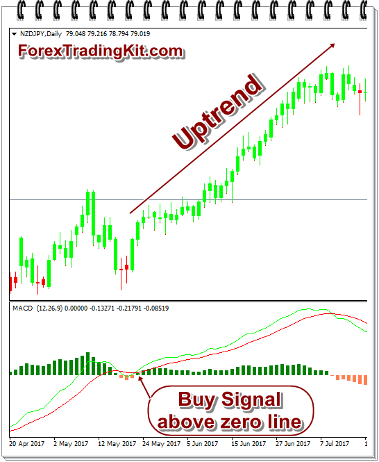
Fig. 1 Bullish signal above zero line in MACD
The above figure is the daily technical chart of NZYJPY currency pair, using MACD indicator. I’ve used MetaTrader software to get above customized MACD indicator and chart.
It is clearly visible from the chart that as soon as MACD crossed above the signal line, the currency pair started moving upward. The crossover was above zero line; thus makes uptrend very strong.
This is also called Bullish MACD.
Sell Signal
The below chart is of EURNZD currency pair in H4 time frame with MACD indicator on MetaTrader software.
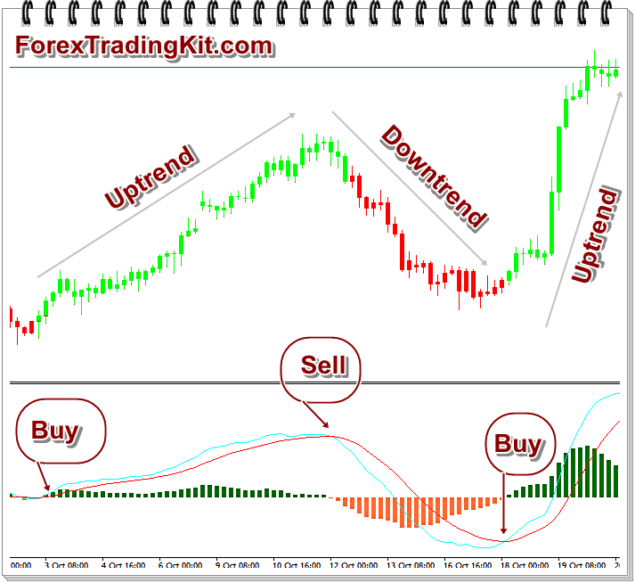
Fig. 2 MACD example on EURNZD forex chart
In the above chart (Fig. 2), MACD indicator buy signal above zero line, making uptrend in the currency pair movement. After that, it gave Sell signal and currency pair obeys MACD and started downtrend. Finally, MACD again gave buy signal and price started moving downward.
MACD Histogram
The next chart is of GBPJPY currency pair daily chart using MACD indicator.
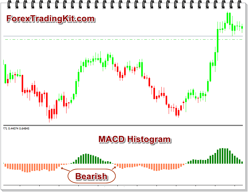
Fig 3. MACD Histogram
In the above chart, I’ve removed MACD and signal line. Thus, it just shows Histogram clearly.
Note when the histogram is above zero (in green color), the currency pair moves upward. And when the histogram is below zero line (coral color), the currency pair moves downward.
MACD Divergence
This is a very important concept of MACD. That means if MACD gives Sell signal and in spite of that the price moves upwards, then sooner or later, the price will obey MACD and will come down.
It can happen vice-versa also.
This is very common in almost every chart.
But practically, I’ve seen that in spite of divergence, the price does NOT obey MACD and it moves in other direction.
So, I suggest you to use other indicators like RSI, Stochastic, Doda Donchian indicator to confirm your move.
Download MACD indicator for MetaTrader 4
I’ve used 2 variants of MACD indicator in the above charts. You may download the zip file containing both the indicators from here.
Just extract the zip file and copy them into MQL4Indicators folder. If confused, click on File -> Open Data Folder menu in your MetaTrader software. It will open the exact folder, where you need to copy the indicators.
External Links
You may read another good tutorial on MACD on DodaCharts.com.
Hope you like the above article useful for trading. If you’ve got any doubts about it, just mention in the comments section below.