Types of Charts on Forex
The forex market charts are usually made in two co-ordinates – the price (laid on the vertical axis) and the time (laid on the horizontal axis). Sometimes the vertical axis also shows a graph of the tick volume.
The time axis can have a different scale, sometimes called an interval, a trading period or a timeframe.
Traditionally, the following time intervals are used as the timeframe: year, month, week, day, 4 hours, 1 hour, 30 minutes, 15 minutes, 5 minutes, 1 minute, single quotation (tick).
Note: single quotation or tick is the price change by the market maker of the market transmitted through information systems simultaneously in the form of two new purchase and sale prices (Ask and Bid).
**Since the forex chart is formed at a price in a certain period of time, for example, an hour, then in each period, the price has 4 values, which, as a rule, are applied to the chart simultaneously: **
* **the opening price of the trading period (open)** – the market price established at the beginning of the trading period. Since at the beginning of the trading period there are always 2 prices (for purchase and for sale), then the opening price is usually calculated as the average between Ask and Bid ie. (Ask + Bid) / 2. In fact, the price of the beginning of the trading period is the first quote of this period.
* **the closing price of the trading period (close)** – the price in the market, formed at the end of the trading period. Since there are always 2 prices at the end of the trading period, the closing price is also usually calculated as the average between Ask and Bid ie. (Ask + Bid) / 2; In fact, at the end of the trading period, the last quotation of the given period.
* **The maximum price of the trading period (high)** is the highest price on the Forex market that has developed over the period (usually Ask is used since Ask is always greater than Bid)
* **the minimum price of the trading period (low)** – the lowest price in the Forex market that has developed over the period (usually used by Bid) ;
Sometimes to these four values, as a stand-alone indicator on the graph, the tick volume is displayed.
– tick volume (tick volume)- the number of ticks (changes in the price of market-makers) who came to the information system for a given period of time.
Types of Charts on Forex
1. Tick the schedule (the Tick chart)
Tick chart is the smallest scale – 1 tick (single quotation market maker for the buying and selling price). This is a graph of Bid and Ask quotes that look like columns on a price chart.
Tick chart
The maximum of each individual column in the tick chart is the Ask quote, the minimum of each particular column is the Bid quote.
Tick chart, as a rule, is not used for market analysis, because its scale is so small that it is not suitable for technical analysis. However, tick schedules are effectively used to accurately determine support and resistance levels, and also to improve the efficiency of purchases and sales, doing so at local minima and highs.
2. Linear schedule (Line Chart)
Line graph is constructed by one of the prices for the periods indicated above. In most cases, it uses the closing price (address close e-) , but can also be used the opening price (open), the maximum price for the period (High) , the minimum price for the period (Low) or synthetic variants:Median Price ([High + Low] / 2) or Typical Price ([High + Low + Close] / 3).
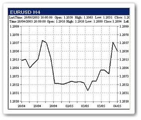
Line Chart
The linear chart, according to traders, has a number of advantages and disadvantages.
Advantages of Line graph:
- convenience in the search for figures of technical analysis (patterns).
- the lack of redundancy
Disadvantages of Line graph:
- it is impossible to assess what is happening inside the trading period, there were significant rises or fall in prices
- it is impossible to see whether were gaps (GAPS) – price gaps between the previous closing and opening of the follow-up period.
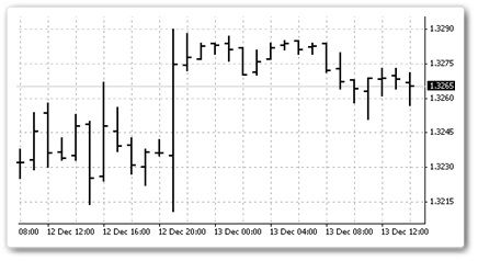
3. The graph bars (Bar chart), chart interval histograms
When constructing a bar graph, all four basic price values are used: opening, maximum, minimum and closing (open, high, low, close).
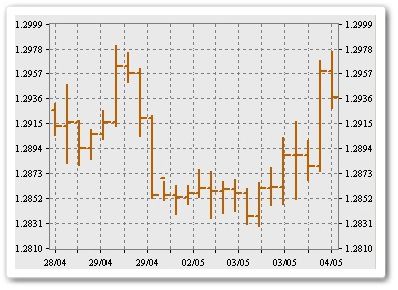
Bar chart
On the bar chart, each period is designated by a vertical line (representing the price fluctuation range within the period), to the left and to the right of which there is one line.
Each period, for example, an hour, looks like this: The upper end of the vertical line shows the level of the maximum price that the market reached in this period.
Accordingly, the lower end of the vertical line is the minimum price level that the market reached during this period.
Thus, the vertical line as a whole is the trading range of the period (for example, hours) or the general boundaries of price fluctuations within the period.
The bar on the left represents the price level, which was at the beginning of the period and is called the open price.
The dash indicates right price level that existed at the time of closure period (e.g., from an hour) and is called a closing (close).
Since the right bar denotes the price at the beginning of the period (the opening of the period), and the left one indicates the price at the end of the period (the closing of the period), then if the left line is higher than the right, it means that the price in the forex market fell during this period. If on the contrary – has grown.
Benefits of Bar chart:
- You can roughly assess what happened inside the trading period, whether there were significant ups or downs in prices
- You can determine the presence of gap gaps.
Disadvantages of Bar chart:
- It is difficult at first glance to assess whether the market has grown over the period or not.
- It is impossible to determine the nature of the movement within the period (you need to move to smaller scales).
3. Japanese candlesticks or Korean candles
Schedule candlestick similar in functionality and displayed with the bar graph, but is more convenient for visual perception.
When building a Japanese candlestick chart – All four basic values of the price are also used: opening, maximum, minimum and closing (open, high, low, close). Each individual candle as well as on the bar graph means a certain period of time, for example, 1 hour.
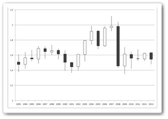
Japanese candlesticks
- The wide part of the candle (rectangle) is called the body (real body or jitter). The body is the price range between the opening and closing prices. A filled candle body means that the closing price was less than the opening price of the period, i.e. for the period of prices as a whole fell (black candle – “in-sen”).
- An empty body of a candle means that the closing price was greater than the opening price, i. e. prices within the range grew (white candle – “yo-sen”).
- The line above the body of the candle is called the upper shadow (upper shadow), and its upper point indicates the maximum that reached the price within the period.
- The line under the body of the candle is called the lower shadow (lower shadow) and its lower point is the minimum that reached the price within the period.
Note: the body of both growing and falling candles in various technical analysis programs can be of different colors. In the original, a red candle means growth, black – a fall. However, according to legend, the first Candlestick charts came to America from Japan to photocopy, where the incident candle is black and growing to become white. There are other combinations, for example, green growing, and red falling. Usually, the following rules apply: a filled candle is falling, and a candle of the background color is a growing or falling candle darker than growing.
There are other types of graphs.
- Volumetric Japanese candles (Candlevolume)
- Equivolume graphics (Equivolume).
- Point -by -point graphs (Point and Figure, also called XO, or crosses-zeros)
- breakthrough Charts 3 lines (the Three-Line Break)
- graphics Renko (Renko)
- graphics Kagi (the Kagi)
Note: Be careful, often on a vertical axis (price) is not used arithmetic and logarithmic scale. It has become widespread in the analysis of long-term trends when the price of currencies in Forex can vary by tens of percent. If on the arithmetic scale the distances between the divisions of the price for the axes are the same, then on the logarithmic scale the distance between the divisions reflects the same percentage change in price.